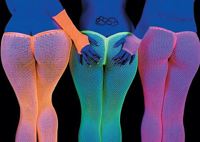
 Colour is a popular method of attraction not only in the design and advertising business, colour is used as entertainment in the entertainment industry, from scantily dressed girls to lighting.
Monday, 17 August 2009
Fabio, Paddy and Alan
 Colour is a popular method of attraction not only in the design and advertising business, colour is used as entertainment in the entertainment industry, from scantily dressed girls to lighting.
pantone 8762
design week cutting
panting dog
pantone 1680

Interesting use of both colour and typography, stemmed from the idea that your brain fills in the gaps, in my opinion it makes a nice static print, by covering up all but one line it becomes much harder to understand and according to the artist, adding one more line of type makes the piece much less comprehendible.
Sunday, 16 August 2009
pantone 1657
A website i stumbled across is hex day where it encourages you to chose a colour each day the below quoted explanation explains.

Jon Sykes: Hexday is "a social experiment in color picks" I guess that's what I'd say. It's hard to say really. It's evolving. Originally it was probably more of a test web app. I was just starting to use CakePHP (which is awesome by the way) for my personal project web apps, and I came up with an idea that if you allowed people to pick 1 color and only 1 color every day, what would they pick. So I built a web app around the idea.
Thursday, 13 August 2009
pantone 1689
Split brain...obviously!

apparently there are two sides to the brain, color and visual elements activate the right side of the brain, your emotions, and the printed words effect the left side of the brain your logic. Hence typography and colour being the fundamentals behind good design and hence when you try to read these piece above its rather confusing!! It is something i am interested in but this is a little two psychological for me, i am interested by spurring a reaction like most design should but i do not want to look to deeply into it.
Sony tv add
Colour is the main selling point for the sony bravia, a series of very clever and colourful adds where created, despite the selling point and subject being colour the advert reflects very well an idea of fun quality and attention to detail and more obviously imaculate execution, all things one might look for when buying a tv.
ipod colours


Old Colors
| &
| New Colors
|
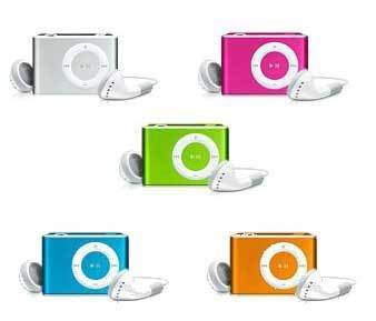
IPOD's gone all grown up is it that they feel they should now be targetting a new market, getting the ever reluctant older generation into technlogy or is it simply that they feel these are better colours and their original buyers will replace there old items. Why isn't there a bright blue mac book pro, personally i prefer the older colours! I always feel the smaller the item the brighter the colour it should be purely for the practical purpose of not loosing it!
Friday, 7 August 2009
Viral advertising

Thursday, 6 August 2009
Exhibition visit
 At the moment i am taking a particular interest in colour so i decided to look at Banksy exhibition. Not only is he notorious for his black and white stencils, which are evidently very powerful despite there lack of colour, an obvious argument against a proposed dissertation title, but he is also very clever how he does use colour . In this exhibition Banksy did use colour in a very clever way often jucstaposing his choice of media, making the compositions more vibrant exciting and attractive. These were often contemporary industry colours such as Easy-Jets orange amongst others.
Exhibition visit
 This is the booklet form an exhibition i went to. Despite not being able to rotate this it is clearly the booklet from the Tate's colour chart exhibition. A useful insight into the unprecedented role of colour in graphic design, fashion design and interior design. The exhibition looked at the moment when artist began to perceive colour as a ready made rather than as an expression of their creativity. The exhibition demonstrated well how colour is used sometimes in a very lazy way as a short cut more or less. It was an interesting exhibition and i took away from it this obvious lazy use of colour and how if you choose to deconstruct many pieces of art and design, the true irrelevance becomes apparent.


